
To Get Started:
- Go to Members Area in the left-sidebar menu and then click on Online Courses.
Open the relevant course by clicking the Content (paper) button.
- Choose course page you would like to edit by clicking the Edit (pencil) button.

- Once you have the Course page open, in the left-sidebar menu, you will find all the settings for your page.

Page Options
This is where you control the basic settings for your page template e.g. 
Details
- Course
If you want to move your Course page to a different Course, you may select the preferred online course in this drop down menu. - Page Layout
You may customize the layout for each course page.
 + Boxed – Default
+ Wide Top Nav – The items take the full width of the page.
+ Wide Left Nav – This layout will allow you to have the navigation on the left.
+ Wide Left Nav Content Above Image – This layout will allow you to have the wide left navigation with content on top of the image.Important:
For ALL layouts, the Mobile version of the page will always be the current option (boxed) with the progress tracking and menu below the image. The other layouts are not applicable.When changing the screen size, if width is equal or less than 1230px, it will always be on top navigation.
Custom Codes
- Header, After Body Tag, and Footer
Add codes here. e.g. Facebook pixel, Google Analytics, etc.
- Add Audience Segmentation
If you want to take advantage of Audience segmentation, this is a great tool to use.
It allows you to setup custom videos that will display for each Audience group that you have created.
Page Background
Customize your course page’s background. You can upload an image from your computer or site’s Image Gallery or use a plain color as your background. 
The changes on Page Background will be applied here:

- Image – You can Select image from gallery or upload an image by clicking on Browse button, while Remove Image will remove the image currently uploaded.
- Background Repeat – This feature will repeat the image you upload for the background, so that you have multiples copies of the same image displayed across the section.From the drop down, you have different repeat options to choose from i.e.
No Repeat – the uploaded image will display as is
Repeat – the uploaded image will repeat vertically and horizontally across the section
Repeat-x – uploaded image will repeat horizontally only
Repeat-y – uploaded image will repeat vertically only - Background Size – This feature allows you to control how the uploaded image displays.
Auto – the image will display as per it’s dimensions
Cover – the image will cover the entire section
Contained – the image will display in top half of the section.
Parallax – the image will fill the width and height of the section and all rows and blocks added to the section will appear above the section image as if it is floating.
100% 100% – the image will fill the width and height of the section and the image, rows and blocks added to the section will move as one unit as you scroll down the page.
100% auto – the image will fill the width and will be centered. - Overlay Color – The feature allows you to change the overlay color of the page.
To change the overlay color, you can either add a Hex code in the field provided or choose a color from the Color Wheel.
If the Color Wheel is closed, simply click on the Color Picker button to the right of the overlay field. - Background Color – The feature allows you to change the background color of the section. To change the background color, you can either add a Hex code in the field provided or choose a color from the Color Wheel.
If the Color Wheel is closed, simply click on the Color Picker button to the right of the background field. - Background Color Opacity – This feature allows you to change the opacity of the background color.
Simply move the slider left or right to increase or decrease the transparency of the image.
Content Background
With this you can change the background color of the course content. By default, the background color is set to transparent. Select color from the color picker.
 (see image below for the content background change)

Page Spacing
You can add padding around your section so that there is additional space. Simply add the numeric (pixel) value to the Top and Bottom padding field provided.
More Options 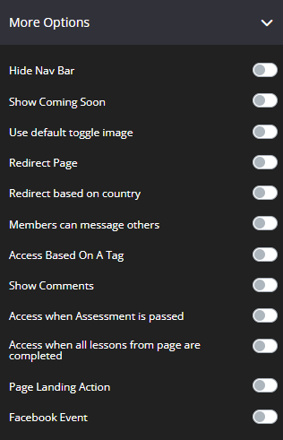
- Hide Nav Bar
By default, it’s disabled. Once enabled, this will hide the navigation bar in the course page. - Show Coming Soon
If this option is enabled, the Coming Soon text will be displayed all the time.
It’s recommended if you don’t want to display the content on the page.
NB! This option is unconditional. If there’s a drip feed on the page, it doesn’t matter what options are set. Therefore, the Coming Soon text will still be displayed. - Use Default Toggle Image (160 x 100):
This will use the default toggle image to all lesson blocks.
You can click on Browse or Select from gallery.
+ Browse – upload a new image from your computer.
+ Select from gallery – choose from the images that you’ve already used in other pages/templates. - Redirect Page
This will let you redirect members that reach this page to a different page that you can choose from the drop-down.
Delay: You can also set up a delay for this action, depending on what best suits you.
Pass URL parameters to next URL – When a user is redirected to the page that you have set up, you may pass the URL parameters to the next page. Simply switch the toggle on.

Add Audience Segmentation – If you want to take advantage of Audience segmentation, this is a great tool to use.
It allows you to setup custom pages that will display for each Audience group that you have created.
Under Link, you can choose the page to redirect users to (e.g. campaign, course, blog, and custom URL)
For more information, you may check the Audience booster.

- Redirect based on country
This allows you to redirect visitors to a different URL based on their country when they try to access a specific page.
To learn more about this feature, visit How to redirect users to a different URL based on country using Page Options - Members can message others
By default, it’s disabled. Once enabled, this will allow your members to message each other in your Social Wall page or if the Comments section is enabled. - Access Based on a Tag
This option will allow you to provide access to your members based on the tag selected in the settings.
Give Access to Page if User Has:
Select the email system you want to use. The options here will be based on the current integrated email system on your KLEQ site.
Email System Tag:
Select your email system’s tag from the drop-down menu or create a new tag.
Redirect to this page if they don’t have the tag:
Select the page or URL you want your members to be redirected to if they don’t have the tag.
Or, you may also select Don’t Redirect at the bottom of the drop-down menu.
Use this URL:
You may use this link to directly access the page.
Important: Replace XXX with the Contacts Email.
- Show Comments
This allows your members to add comments to your course pages. - Access when Assessment is passed
This allows your members to have access to the course page after they have completed the assessment you require.
You may choose which assessment they will have to take from the drop down after you have checked the box.
You can find more information regarding how to set up your assessments here: Create Assessments for your Course Pages - Access when all lessons from page are completed
This allows your members to have access to another Course Page after they have completed all the lessons from the current Course page.
You can choose which Page you will grant them access to from the drop down after you have checked the box. - Page Landing Action
Allows you to apply a specific action as users land on a certain page.
To know more about this feature, visit How to use the Page Landing Action Feature - Facebook Event
This allows you to track and add different events to send to Facebook; simply edit your page.
To learn more about this feature, visit Integrating with Facebook Conversion Pixel
Header Image
Upload the Header image you would like to appear at the top of the course page.
- Hide Item
Enabling this option will hide the Header Image for the current page.
 + Browse – upload an image from your computer.
+ Select from gallery – if you want to use an image that’s already been uploaded or been used in another template or page. Once clicked, the image gallery popup window will appear with all the available images listed.
Coming Soon Text
This feature allows you to add teaser text to your course page, when the Course Page Drip Feed feature is enabled. Simply add the text you would like to display at the top of the page and SAVE. 
Details
Add and adjust the text you want to display on the Coming Soon Text.
Text
In the field provided, add the new text you want to include in this section. 
Font
This tool will help you fully customize the font style of your text.
-
- Font Family
Use this feature to change your text’s Font type.
Click on the drop-down and select the Font type you want. - Font Size
This changes the size of your text.
Simply click on the slider and move it left or right to increase or decrease the text size. - Font Weight
This feature changes the weight of text.
The font weight property sets how thick or thin characters in text should be displayed.
Click on the drop-down and select the font weight you prefer.IMPORTANT: If the bold format button is set in Details > Text field, Font Weight will not apply anymore.

- Line Height
This feature increases or decreases the space between the lines of text.
Click on the drop-down and select the line height you prefer. - Letter Spacing
This feature increases or decreases the space between letters.
Click on the drop-down and select the letter spacing you prefer. - Text & Links Color
This feature changes the color of your text and text links.
To use custom colors, simply paste the Hex code of the exact color you want in field provided e.g. #000000 = black or click on the Color Picker button to the right of the field.
This will open the Color Wheel, where you can select whichever color you prefer.
- Font Family
Background
The feature allows you to change the background color of the text. 
- If you type the word transparent in to the field provided, the background will be transparent and show what ever color is visible on the page.
- To change the background color, you can either add a Hex code in the field provided or choose a color from the Color Wheel.
- If the Color Wheel is closed, simply click on the Color Picker button to the right of the background field.
- The Background Color Opacity feature allows you to change the transparency of the background color of your text. Simply move the slider left or right to get the desired effect.
Border
This feature allows you to add a border around your text. 
- Borders
Select whether you want a full border where text is wrapped in a border or simply one side of the text has a border e.g. None, All Border (full border), Top Border, Bottom Border, Right Border, Left Border, Left and Right Borders - Border Type
You can select the style for your border.
TIP 01 In order to see the border around your text, you need to select one of the actual style options available e.g. Solid, dashed or dotted. If the setting is left on No Border Style, your selection in the Borders setting will not work.
TIP 02 To add space between your text and the border, remember to add Padding.
For more info on how to do this, scroll down to the Spacing section below.
- Border Size
You can change thickness of the border by selecting the pixel width you prefer. - Border Radius
You can add rounded edges to the border by selecting the relevant pixel or percentage width. You may now control each side by entering the number on the Top Left, Top Right, Bottom Right and Bottom Left box. - Border Color
You can change the color used for the border. To use custom colors, simply paste the Hex code of the exact color you want in field provided e.g. #000000 = black or click on the Color Picker button to the right of the field. This will open the Color Wheel, where you can select whichever color you prefer.
Box Shadow
This feature allows you to add a shadow around the border of your text. 
- Horizontal Shadow Position
Adjust the horizontal position of the shadow. Use negative integer value to adjust horizontal position to left. Or use positive integer value to adjust to right. - Vertical Shadow Position
Adjust the vertical position of the shadow. Use negative integer value to adjust vertical position to top. Or use positive integer value to adjust to bottom. - Blur radius
Adjust the blur radius. This will determine how blurry the shadow will be. Use positive integer value. - Spread radius
Adjust the spread radius. This will determine how large the shadow will be. Use integer value. - Shadow Color
To use custom colors, simply paste the Hex code of the exact color you want in field provided e.g. #000000 = black, or click on the Color Picker button to the right of the field.
This will open the Color Wheel, where you can select whichever color you prefer. - Shadow Color Opacity
Adjust the opacity or transparency of the shadow. Click on the slider and move it left or right to increase or decrease the opacity. - Shadow Position
Adjust the position of the shadow, either inside or outside (default) the button
Spacing
This feature allows you to add more space around your text. 
- Padding
You can add padding around your text, so that there is additional space. Simply add the numeric (pixel) value to the Top, Bottom, Right or Left Padding field provided.
This is particularly helpful if you want to add spaces inside your text border. - Margin
You can add margin around your text, so that there is additional space.
Simply add the numeric (pixel) value to the Top, Bottom, Right or Left Margin field provided.
This is particularly helpful if you want to add spaces outside your text border.
Favorites
You may add the Course Page, Social Wall, Private Chat and Live Event as Favorites.