
The page builder Row is a structure that houses Blocks for a particular part of a Campaign or Course pages. Rows are surrounded by a green border.

Each Row added to a page has individual settings and each column of that row has individual settings.

Below is an overview of the various Row settings:

Details
This feature allows you to adjust the width and column sizes of the row. 
- Width
From the drop-down, simply select the relevant width you prefer
e.g. 100% | 90% | 80% | 70% | 60% | 50% - Column Sizes
This option is only available for multi-column rows.
This will allow you to specify the exact dimension of each column.
Simply select the size from the drop-down menu.
Note: The total width of columns should be 100%.
Background
The feature allows you to change the background of a row. 
- Background Color
The feature allows you to change the background color of the row.
To change the background color, you can either add a Hex code in the field provided or choose a color from the Color Wheel.
If the Color Wheel is closed, simply click on the Color Picker button to the right of the background field. - Background Color Opacity
This feature allows you to change the opacity of the background.
Simply move the slider left or right to increase or decrease the transparency. - Media Background
Simply enable the toggle to use Image background.
- Image
Upload an image you want to use for the background of your row. Click on Browse to upload an image from your computer.
OR, click Select from gallery if you want to use an image that’s already been uploaded or been used in another template or page. Once clicked, the image gallery popup window will appear with all the available images listed. - Background Repeat
This feature will repeat the image you upload for the background, so that you have multiples copies of the same image displayed across the row.From the drop-down, you have different repeat options to choose from i.e.
No Repeat: the uploaded image will display as is
Repeat : the uploaded image will repeat vertically and horizontally across the row
Repeat-x: uploaded image will repeat horizontally only
Repeat-y: uploaded image will repeat vertically only - Background Size
This feature allows you to control how the uploaded image displays.
Auto: the image will display as per it’s dimensions
Cover : the image will cover the entire row
Contained : the image will display in top half of the row.
Parallax : the image will fill the width and height of the row and all blocks added to the row will appear above the image as if it is floating.
100% 100%: the image will fill the width and height of the row. The image and blocks added to the row will move as one unit as you scroll down the page.
100% auto: the image will fill the width and centered. - Background Position
This feature allows you to control the position of your background image inside of the row.
Borders
This feature allows you to add a border around your row. 
- Borders
Select whether you want a full border where the row is wrapped in a border or simply one side of the row has a border e.g. None, All Border (full border), Top Border, Bottom Border, Right Border, Left Border, Left and Right Borders - Border Type
You can select the style for your border.TIP 01 In order to see the border around your row, you need to select one of the style options available e.g. Solid, dashed or dotted. If the setting is left on No Border Style, your selection in the Borders setting will not work.TIP 02 To add space between your row and the border, remember to add Padding.
For more info on how to do this, scroll down to the Spacing section below. - Border Size
You can change thickness of the border by selecting the pixel width you prefer. - Border Radius
You can add rounded edges to the border by selecting the relevant pixel or percentage width. You may now control each side by entering the number on the Top Left, Top Right, Bottom Right and Bottom Left box. - Border Color
You can change the color used for the border. To use custom colors, simply paste the Hex code of the exact color you want in field provided e.g. #000000 = black or click on the Color Picker button to the right of the field. This will open the Color Wheel, where you can select whichever color you prefer.
Box Shadow
This feature allows you to add a shadow around the border of your Leaderboard Block.

- Horizontal Shadow Position
Adjust the horizontal position of the shadow. Use negative integer value to adjust horizontal position to left. Or use positive integer value to adjust to right. - Vertical Shadow Position
Adjust the vertical position of the shadow. Use negative integer value to adjust vertical position to top. Or use positive integer value to adjust to bottom. - Blur radius
Adjust the blur radius. This will determine how blurry the shadow will be. Use positive integer value. - Spread radius
Adjust the spread radius. This will determine how large the shadow will be. Use integer value. - Shadow Color
To use custom colors, simply paste the Hex code of the exact color you want in field provided e.g. #000000 = black, or click on the Color Picker button to the right of the field.
This will open the Color Wheel, where you can select whichever color you prefer. - Shadow Color Opacity
Adjust the opacity or transparency of the shadow. Click on the slider and move it left or right to increase or decrease the opacity. - Shadow Position
Adjust the position of the shadow, either inside or outside (default) the button.
Alignment
This feature allows you to adjust the vertical alignment of the elements inside your Row.

Spacing
This feature allows you to add more space around your row.
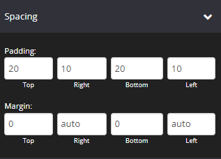
- Padding
You can add padding around your row so that there is additional space.
Simply add the numeric (pixel) value to the Top, Bottom, Right or left padding field provided.
This is particularly helpful if you want to add a border around your row. - Margin
This feature allows you to add more space outside the row.
Simply add the numeric (pixel) value to the Top, Bottom, Right or left margin field provided.
Options

- Element Id
Shows the element id of the specific row
This is useful for under the hood, if you wanted custom HTML, coding/scripting for CSS and JavaScript. You can use the targeted id element for page design, rules and etc. - Classes
This feature is used to define equal styles for elements with the same class name. To learn more, please check here - Delay in Seconds
This feature allows you to add a delay timer for all blocks included in a row.
Simply add the time in seconds, for how long a user should wait before this row will be visible on the page.
Drip
This feature allows you to use the Drip Feed feature on Row.
This option is available on Course pages only.
- Type of drip
Automated: Based on registration date – This will deliver the content of the page on autopilot and members will be able to access the page depending on their course registration date.
Scheduled: Deliver on a specific date – You can choose a specific date when the element will be accessible. - Number of days / Time: Depending on the type of drip that you will select, for Automated, you have to specify the number of days based on the registration date when they can access the element. While for Scheduled, simply select the date, time, and timezone.
Note: The Timezone that is set in Global settings will be applied.
Animation
This tool allows you to add animation effects to your Rows.

- Type
From this drop-down you can choose a trigger to activate the animation i.e.
+ None – no animation will be applied
+ On Page Load – the animation is triggered as the page loads
+ On Page Scroll – the animation is triggered only when the user scrolls to that section. - Style
This feature adds an animation style to your Row. Simply choose the preferred option from the drop-down menu.
+ Fade In – the Row will fade in from the background
+ Scale In – the Row scales in from the background
+ Top – the Row will slide in from the top
+ Right – the Row will slide in from the right
+ Bottom – the Row will slide in from the bottom
+ Left – the Row will slide in from the left - Delay (ms)
If you want to add a time delay for when the Row appears, simply add the delay in milliseconds e.g. 3000ms will be 3 second delay.
Mobile
This feature allows you to adjust some settings of the row when in mobile view.
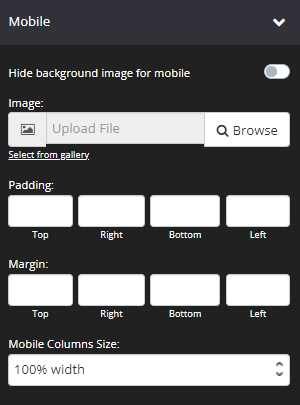
- Hide background image for mobile
Control whether you want to display the Background Image for the row when in mobile view. If enabled, Upload Image will be disabled for the column. - Image
Upload a different background image that will be displayed when the page is viewed in a mobile device. - Padding
You can add padding around your row when in mobile view, so that there is additional space. Simply add the numeric (pixel) value to the Top, Bottom, Right or Left Padding field provided.
This is particularly helpful if you want to add spaces inside your row border. - Margin
You can add margin around your row when in mobile view, so that there is additional space.
Simply add the numeric (pixel) value to the Top, Bottom, Right or Left Margin field provided.
This is particularly helpful if you want to add spaces outside your row border. - Mobile Columns Size:
Adjust the columns sizes of the columns when in mobile view.
This option is available for multi-column rows only.
+ 100% Width – each column will use 100% width of the row, and all columns will display in a vertical alignment.
+ custom % – allows you to change each column’s size with custom value.
Display
This feature allows you to choose the type of device you want the row to display.

- Display
From this drop-down, you can choose which device you want to display the row.
+ All Devices – the Row will be displayed on both desktop and mobile devices
+ Desktop Only – the Row will be displayed on desktop devices only
+ Mobile Only – the Row will be displayed on mobile devices only
+ None – the Row will be grayed out and not visible on both desktop and mobile devices
Column Settings
The final settings relates specifically to each Row column, depending on how many columns you selected for your row e.g. A 3-column row will have the following additional setting sections: Column 1 Settings | Column 2 Settings | Column 3 Settings etc.
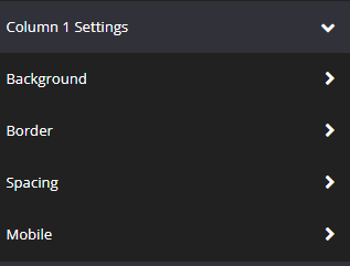
Here you will be able to adjust the Background, Border and Spacing for each column.
- Background
The feature allows you to change the background of the column. - Border
The feature allows you to change the border of the column. - Spacing
This feature allows you to add more space around the column.
+ Outer Padding – The space between row side and the column side.
+ Inner Padding – The space between the column side and the blocks inside. - Mobile
This feature allows you to add more space around the column in mobile view.
That’s it, click SAVE and you are done!