
Course block is a special block only available on Member’s Area Home Page and Portal page. This block cannot be duplicated but can be deleted and moved around the page. You can add multiple course blocks and edit how the courses will be displayed on the page.

For more details about Portal page, please go to Portal Pages
To customize the Member’s Home page, please go to Customize your Membership Site
Add a new Course block
Simply click on the + to add a new block and on the left-side panel click on Courses

Course block Settings

Details
-
- Show Courses from
This option allows you to display online courses included in certain course groups. For more details about this go to Course Groups
If you select All Groups it will display all online courses available and don’t matter what specific group they belong to or if no course group available.
However, if you have created course groups and selected it on this option, the Course block will only display the online courses for the group.
- Show Courses from

- That the user…
There are 2 choices under this option: Has access to or Does not have access to
Has access to
This will display the online courses a member has access or registered to depend on the Course group you have selected on Show Courses from…It will appear like this (as an example):

Does not have access to
This will display the online courses a member has no access to or not registered on Manage Members.
By default, the text will be displayed before the list of online courses like this “Some Courses You Might Like…” but you can edit this on course block settings under “Block Title”It will appear like this (as an example):
 IMPORTANT: If you have enabled Cross Promote feature you have to add a new course block on the member’s area homepage and use the Does not have access to option to be able to display the promoted online courses.
 - # of items per row
Allows you to set 1, 2, or 3 items per row.

- Image Position
Allows you to change the course image positions to Top, Left, or Right.
When Left or Right position is selected, Image Width option will be available.
Width options are 40%, 50%, or 60%. - Forum Position
Allows you to change the Forum position tab to either First or Last. - Show text if empty
Once enabled, Label for members with no courses will be available. This label will appear if a member does not have access to any of the courses the Course Block is displaying.
Courses Options
This will allow you to manage how the online courses list will be displayed on the member’s area homepage.

- Hide Image
The image of the course will not be displayed

- Hide Title
Title of the Course will not be displayed

- Hide Description
The course description will not show up on the home page

- Hide Button
The course button will not be shown on the member’s area home page.

Image
This setting will allow you to customize your image box.
For example, if you want to add round edges on your course images.

Font Title
This tool will help you fully customize the font style of Course title text (as shown below)
 Here are the settings:

- Font Family
Use this feature to change your text’s Font type.
Click on the drop-down and select the Font type you want. - Font Size
This changes the size of your text.
Simply click on the slider and move it left or right to increase or decrease the text size. - Line Height
This feature increases or decreases the space between the lines of text.
Click on the drop-down and select the line height you prefer. - Text Color
This feature changes the color of your text.
To use custom colors, simply paste the Hex code of the exact color you want in the field provided e.g. #000000 = black, or click on the Color Picker button to the right of the field.
This will open the Color Wheel, where you can select whichever color you prefer.
Font Text
This tool will allow you to adjust the font size, color, font type/family and line-height of the Course Description

- Font Family
Use this feature to change your text’s Font type.
Click on the drop-down and select the Font type you want. - Font Size
This changes the size of your text.
Simply click on the slider and move it left or right to increase or decrease the text size. - Line Height
This feature increases or decreases the space between the lines of text.
Click on the drop-down and select the line height you prefer. - Text Color
This feature changes the color of your text.
To use custom colors, simply paste the Hex code of the exact color you want in the field provided e.g. #000000 = black, or click on the Color Picker button to the right of the field.
This will open the Color Wheel, where you can select whichever color you prefer.
Button
This feature will allow you to change the settings of your button on the online courses list

- Font
This feature changes the color of the text inside the button.
To use custom colors, simply paste the Hex code of the exact color you want in the field provided e.g. #000000 = black, or click on the Color Picker button to the right of the field.
This will open the Color Wheel, where you can select whichever color you prefer.

- Background Color
This feature will edit the color of the button itself.
To use custom colors, simply paste the Hex code of the exact color you want in the field provided e.g. #000000 = black, or click on the Color Picker button to the right of the field.
This will open the Color Wheel, where you can select whichever color you prefer.

- Width
From the drop-down, select the preferred width % you would like for your button. The higher the % selected, the less margin will be added on either side of the block.

- Border Radius
You can add rounded edges to the border by selecting the relevant pixel width. You may now control each side by entering the number on the Top Left, Top Right, Bottom Right and Bottom Left box.
- Box Shadow
This feature allows you to add a shadow around the border of your button.
+ Horizontal Shadow Position
Adjust the horizontal position of the shadow. Use negative integer value to adjust horizontal position to left. Or use positive integer value to adjust to right.
+ Vertical Shadow Position
Adjust the vertical position of the shadow. Use negative integer value to adjust vertical position to top. Or use positive integer value to adjust to bottom.
+ Blur radius
Adjust the blur radius. This will determine how blurry the shadow will be. Use positive integer value.
+ Spread radius
Adjust the spread radius. This will determine how large the shadow will be. Use integer value.
+ Shadow Color
To use custom colors, simply paste the Hex code of the exact color you want in field provided e.g. #000000 = black, or click on the Color Picker button to the right of the field. This will open the Color Wheel, where you can select whichever color you prefer.
+ Shadow Color Opacity
Adjust the opacity or transparency of the shadow. Click on the slider and move it left or right to increase or decrease the opacity.
+ Shadow Position
Adjust the position of the shadow, either inside or outside (default) the button
- Alignment
Allows you to adjust the horizontal alignment of your button. You may place it on the left, center or right side of your page.

- Spacing
This feature allows you to add more space around your button. + Margin
You can add margin around the button of your course block, so that there is additional space.
Simply add the numeric (pixel) value to the Top, Bottom, Right or Left Margin field provided.
This is particularly helpful if you want to add spaces outside the button.
Background
This feature will allow you to change the color of the course background (as shown below)

- Background Color
This feature will allow you to edit the color
To use custom colors, simply paste the Hex code of the exact color you want in the field provided e.g. #000000 = black, or click on the Color Picker button to the right of the field.
This will open the Color Wheel, where you can select whichever color you prefer.

Width
From the drop-down, select the preferred width % you would like for your course block. The higher the % selected, the less margin will be added on either side of the block.

Border
This feature allows you to customize the edges of your course item background.
- Border Radius
This feature allows you to change the edges around the course item box.
Alignment
Allows you to adjust the block alignment of your Course Block. You may place it on the left, center or right side of your page.
Spacing
This feature allows you to add more space on the bottom of the course block.

- Box Padding
This feature allows you to add more space around the image box.
Simply add the numeric (pixel) value to the field provided. - Content Padding
This feature allows you to add more space around the title and description.
Simply add the numeric (pixel) value to the field provided. - Margin Bottom
This feature allows you to add more space below the block.
Simply add the numeric (pixel) value to the field provided.
Options
This feature allows you to use the available options for extra coding (HTML/CSS/JavaScript)
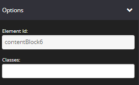
- Element Id:
This shows the element id of a specific block, which can then be used by CSS and JavaScript to perform certain tasks for the element with the specific id value. To learn more, please check here
- Classes:
This feature allows is used to define equal styles for elements with the same class name. To learn more, please check here
Animation
This tool allows you to add animation effects to your Course Block.

- Type
From this drop-down, you can choose a trigger to activate the animation i.e.
+ None – no animation will be applied
+ On Page Load – the animation is triggered as the page loads
+ On Page Scroll – the animation is triggered only when the user scrolls to that section. - Style
This feature adds an animation style to your Course Block. Simply choose the preferred option from the drop-down menu.
+ Fade In – the Course block will fade in from the background
+ Scale In – the Course block scales in from the background
+ Top – the Course block will slide in from the top
+ Right – the Course block will slide in from the right
+ Bottom – the Course block will slide in from the bottom
+ Left – the Course block will slide in from the left - Delay (ms)
If you want to add a time delay for when the Course Block appears, simply add the delay in milliseconds e.g. 3000ms will be 3-second delay.
Once you’re done, click the SAVE button.