
The Lesson Block allows you to add Lesson toggles to your Course page.
To Do this:
- Go to Members Area in the left-sidebar menu and then click on Online Courses.
Open the relevant course by clicking the Content button.
- It will show you the pages you have for that specific course, choose the one that you would like to edit by clicking the Edit (pencil) button to the right.

- The Page builder for the Course Page will open immediately.
- In the right Preview Pane, mouse over the Row (green border) where you want to add a new Block element. Then mouse over any existing Block (black border) in the Row, and click on the Black Plus (+) icon at the bottom of the Block. This will open the Blocks element list in the left sidebar menu. Here you will find a variety of Blocks that you can add to your campaign pages to further customize the templates that you are working with. Select the Lesson Block.

- Immediately the Lesson Block will appear underneath the Block element you clicked on in the Preview Pane, and the Block settings will appear in the left sidebar menu.
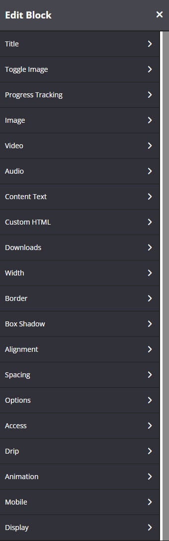
Title
This feature allows you to customize your Lesson Block’s Title.
Title
Add the text for the title that appears on your Lesson.
This will be the text that is visible when your Lesson toggle is closed.

Font
These tools will help you fully customize the font style of the Lesson title.

- Font Family
Use this feature to change your text’s Font type.
Click on the drop-down and select the Font type you want. - Font Size
This changes the size of your text.
Simply click on the slider and move it left or right to increase or decrease the text size. - Line Height
This feature increases or decreases the space between the lines of text.
Click on the drop-down and select the line height you prefer. - Letter Spacing
This feature increase or decreases the space between letters.
Click on the drop-down and select the letter-spacing you prefer. - Text Color
This feature changes the color of your text.
To use custom colors, simply paste the Hex code of the exact color you want in field provided e.g. #000000 = black or click on the Color Picker button to the right of the field.
This will open the Color Wheel, where you can select whichever color you prefer.
Background
This feature allows you to change the background color of the lesson title.

- If you type the word “transparent” into the field provided, the background will be transparent and show whatever color is visible on the page.
- To change the background color, you can either add a Hex code in the field provided or choose a color from the Color Wheel.
- If the Color Wheel is closed, simply click on the Color Picker button to the right of the background field.
Spacing
This feature allows you to add more space around your Title. 
- Padding
You can add padding around your title, so that there is additional space. Simply add the numeric (pixel) value to the Top, Bottom, Right or Left Padding field provided.
This is particularly helpful if you want to add spaces inside your title border.
Icons
This feature allows you to add an icons on your Lesson block. 
- Closed Toggle Icon
You can select on the drop down the different icons that you can use when the Lesson block is close. - Opened Toggle Icon
You can select on the drop down the different icons that you can use when the Lesson block is open. - Icon Color
This feature allows you to change the icon color of the Lesson block.
Toggle Image
This feature allows you to add an image next to your Lesson Title.
- Click Browse to upload an image from your computer.
Or click Select from Gallery to add from your Image Gallery.
Once done, it will appear to the left of the Lesson Title. - If you prefer to have no image show, simply switch the Hide Toggle Image field.
Note: Required image dimensions: 160 x 100px - When uploading an image, the original file name will be kept and a prefix will be added. This will help from an SEO perspective.
For example:
If you will upload an image called John.jpg, the image will be stored as 1234-John.jpg (1234 is the timestamp)
If you will upload an image with special characters on the filename, the image will be stored as %XX (XX are numbers e.g. # to %23)
Progress Tracking
This feature allows you to manage the progress tracking depending on the event (Disable and enable mark complete button).
Progress tracking event:

- On button click
This is the default behavior for the button that says “Mark Complete”.
The “Mark Complete” button is automatically visible and it’s up to members to click it to mark the lesson as “Completed”. - When video watch time is…
The “Mark Complete” button is not visible and will only be displayed as “Completed” if member has watch the video based on the number of seconds setup on this event.
Note: This option will work with self hosted videos only. - When audio time is…
The “Mark Complete” button is not visible and will only be displayed as “Completed” if member has play the audio based on the number of seconds setup on this event. - On button click & when video watch time is….
The “Mark Complete” button is automatically visible and members can click on it to mark lesson as completed and also if they watch the video depending on the number of seconds you have specified, the “Mark Complete” button will automatically mark as “Completed”
Note: This option will work with self hosted videos only. - On button click & when audio time is….
The “Mark Complete” button is automatically visible and members can click on it to mark lesson as completed and also if they play the audio depending on the number of seconds you have specified, the “Mark Complete” button will automatically mark as “Completed” - On button click & when video watch time is….& when audio time is….
The “Mark Complete” button is automatically visible and members can click on it to mark lesson as completed and also if they watch the video and if they play the audio depending on the number of seconds you have specified, the “Mark Complete” button will automatically mark as “Completed” - Do not track progress
This will disable progress tracking on the lesson block and the “Mark Complete” button will not be displayed.
Lesson Complete Action:
You can select on the drop-down the action to perform once the lesson is marked as “Completed”. You can send it to a webhook or apply a specific tag to your email system or do nothing. 
Image
This feature allows you to add an image to your lesson toggle 
- Hide
By default the image feature is enabled.
Simply switch the toggle to Hide if you don’t want the image visible in your toggle. - Click Browse to upload an image from your computer.
Or click Select from Gallery to add from your Image Gallery. - Upload Image
Click on Choose File to select the relevant image for your lesson toggle. - Image Alt text
Add an image title here, this is useful for web accessibility and in case the image failed to load at least a name will be displayed - When uploading an image, the original file name will be kept and a prefix will be added. This will help from an SEO perspective.
For example:
If you will upload an image called John.jpg, the image will be stored as 1234-John.jpg (1234 is the timestamp)
If you will upload an image with special characters on the filename, the image will be stored as %XX (XX are numbers e.g. # to %23)
Video
This feature allows you to add a Video to your lesson toggle. 
- Hide
By default, the video is enabled.
Simply switch the Hide if you don’t want the video visible in your toggle.
Video Type
This feature allows you to add videos from 3rd party platforms like YouTube, Vimeo, Wistia or even self-hosted videos.
- Self Hosted
If you want to add a video hosted on your website Amazon S3, simply add the URL of the video in the field
Your Video URL – Simply add the URL of the image you would like to add.
Video Poster Image URL – The feature allows you to add a static video thumbnail for your video. - YouTube
To add a video from YouTube, simply add your YouTube video ID in the field. You can also enable 2 other options: Autoplay and Show Controls. - Vimeo
To add a video from Vimeo, simply add the Vimeo Video ID in the field.
- Embed Code
To add a video that supports an embed code, simply add the Embed code of that video in the field Insert Code.
More Video Options
This drop-down has additional control features for your video. 
- Auto-play?
Enable or disable the Auto-play option - Control Position
Enable or disable the Video Control Bar - Playback Speed
Enable or disable playback speed in the player, 1x by default. Speed multiplier: 0.5x, 1x, 1.5x, 2x - Download Link
Select whether or not to add a download link option below the video - Allow Pause?
Enable or disable the Pause option for the video
TIP! When Auto-play is enabled, the audio for the video will automatically be muted when users view video using Safari, Chrome or via mobile devices. There will be an Unmute button in the top-right corner of the actual video for users to enable the video audio.
- Controls Color:
Change the color of your video player to match your brand.
To use custom colors, simply paste the Hex code of the exact color you want in field provided e.g. #000000 = black or click on the Color Picker button to the right of the field.
This will open the Color Wheel, where you can select whichever color you prefer. - Video Captions URL:
Add the URL for the caption or subtitle for your video.
The caption must be hosted from a site i.e. Amazon S3.
The caption file type must be a .VTT file.
You may use audio transcriber such as Trint.IMPORTANT: If you are hosting your caption files in Amazon S3, you need to configure the CORS Permissions. For complete instructions, proceed here. - Video Captions Label:
Able to change the label for the video caption option.
By default, the label is ‘caption on’
Video Events
This feature allows you to do some advanced automation by assigning a tag to a contact based on how long they have watched your videos. 
Under the Action drop down, select one of the following options.
NB! Options will depend on your account’s current available integration.
None
This options is selected by default, if enabled no action will happen during the video plays.
Send Webhook
If selected, you will be able to send user data to any platform you want using a Webhook URL.
Apply Infusionsoft Tag
If selected, you will be able to add an Infusionsoft Tag to the contact’s profile.
Apply Active Campaign Tag
If selected, you will be able to add an Active Campaign Tag to the contact’s profile.
Apply ConvertKit Tag
If selected, you will be able to add an Active Campaign Tag to the contact’s profile.
Apply MailChimp Tag
If selected, you will be able to add a MailChimp Tag to the contact’s profile.
Apply Ontraport Tag
If selected, you will be able to add an Ontraport Tag to the contacts profile.
Add to Flodesk Segment
If selected, you will be able to add a Flodesk Segment to the contacts profile.
Add to MailerLite Group
If selected, you will be able to add a MailerLite Group to the contacts profile.
- Once you have selected the relevant action above, click on the Add Item button.

- This will open the Action #1 fields for you to edit:

- Use this link to access page:
You may use this special link to redirect your users to this page.
IMPORTANT: Replace XXX with the Contacts Email.
Time in Seconds
This field allows you to choose when a tag or action should occur during the playback of the video. Simply add the time in seconds.
Tag drop-down
Depending on what action was selected in the Action field, the relevant Tag drop-down will be visible in the Action #1 section e.g. if you choose Apply Infusionsoft Tag, then the Infusionsoft tag drop-down will be visible here.
- You can add as many Action Items as you want to your video. To add more Item fields, simply click on the Add Item button.
App Video Options
- App Download Title
If you have upgraded and your site is accessible in the mobile app, you may set up the title of the downloaded video for offline viewing.
Audio
This feature allows you to add an Audio to your lesson toggle. 
- Hide Audio
By default, this option is disabled.
To show Audio on your Lesson block, simply switch the toggle. - Audio URL
Add your audio URL here. Any self-hosted MP3 can be used (e.g. Amazon S3 ).IMPORTANT:
You may only use the audio URL and not the link to the page. An example of a valid audio URL is https://s3-ap-southeast-1.amazonaws.com/media.one/record-10-14-2018_1-05-09.mp3
As you may see from the above link, it ends with the “.mp3” file type. An audio URL is a link to the actual audio file from your self-hosting site.
- Audio Title
Add the title of the audio, and it will display on your Audio block.
If you have upgraded and your site is accessible in the mobile app, this also be the title that will appear in the Downloads section for the downloaded audio for offline viewing. - Audio Author
Add the author of the audio, and it will display on your Audio block - Image
You can add any audio image here, such as an album cover. - Show Playback Speed
Enable change playback speed in the player, 1x by default.
Speed multiplier: 0.5x, 1x, 1.5x, 2x - Audio Events
This feature will allow you to track how much of the audio they’re listening and apply different tags. Under the Action drop down, select one of the following options.
NB! Options will depend on your account’s current available integration.
None
This options is selected by default, if enabled no action will happen during the audio plays.
Send Webhook
If selected, you will be able to send user data to any platform you want using a Webhook URL.
Apply Infusionsoft Tag
If selected, you will be able to add an Infusionsoft Tag to the contact’s profile.
Apply Active Campaign Tag
If selected, you will be able to add an Active Campaign Tag to the contact’s profile.
Apply ConvertKit Tag
If selected, you will be able to add an Active Campaign Tag to the contact’s profile.
Apply MailChimp Tag
If selected, you will be able to add a MailChimp Tag to the contact’s profile.
Apply Ontraport Tag
If selected, you will be able to add an Ontraport Tag to the contacts profile.
Add to Flodesk Segment
If selected, you will be able to add a Flodesk Segment to the contacts profile.
Add to MailerLite Group
If selected, you will be able to add a MailerLite Group to the contacts profile.
Once you have selected the relevant action above, click on the Add Item button. 
- This will open the Action #1 fields for you to edit:

- Use this link to access page:
You may use this special link to redirect your users to this page.
IMPORTANT: Replace XXX with the Contacts Email.
Time in Seconds – This field allows you to choose when a tag or action should occur during the playback of the audio. Simply add the time in seconds.
Tag drop-down – Depending on what action was selected in the Action field, the relevant Tag drop-down will be visible in the Action #1 section e.g. if you choose Apply Infusionsoft Tag, then the Infusionsoft tag drop down will be visible here.
- You can add as many Action Items as you want to your audio. To add more Item fields, simply click on the Add Item button.
Content Text
Add the description text you want to include inside the lesson toggle.
This will appear just below the video. 
The available formatting settings are:
Bold, Underline, Italic, Strike through, Text color, Background color, Align left, Center, Right, Insert or Edit link and Unlink.
Font
These tools will help you fully customize the font style of content text.
Use this feature to change your text’s Font type.
- Font Family
Click on the drop-down and select the Font type you want. - Font Size
This changes the size of your text.
Simply click on the slider and move it left or right to increase or decrease the text size. - Line Height
This feature increases or decreases the space between the lines of text.
Click on the drop-down and select the line height you prefer. - Letter Spacing
This feature increase or decreases the space between letters.
Click on the drop-down and select the letter-spacing you prefer. - Text Color
This feature changes the color of your text.
To use custom colors, simply paste the Hex code of the exact color you want in field provided e.g. #000000 = black or click on the Color Picker button to the right of the field.
This will open the Color Wheel, where you can select whichever color you prefer. - Links Color
This feature will allow you to change the color of the links.
To use custom colors, simply paste the Hex code of the exact color you want in field provided e.g. #000000 = black or click on the Color Picker button to the right of the field.
This will open the Color Wheel, where you can select whichever color you prefer.
Custom HTML
This feature allows you to add a Custom HTML to the Lesson Block below the text content. 
- Add Custom HTML
Simply paste HTML or Javascript code in the field provided.
Downloads
This feature allows you to add a Downloads and Resources section to your lesson toggle.
To activate it, switch the Hide option. The Downloads and Resources section will appear at the bottom of the content area of the lesson toggle. 
“Add Item” button
Click on this button to add download link fields to your Download.
By default, your first link section will be called
Download #1
- Link
Add the URL of the site you would like to send your user to or the download link for a resource. - Label
Give your link a name - Open In New Tab
From the drop-down, select YES or NO, to confirm if the link should open in a new tab
- Custom Icon
Once enabled, you may click on the drop-down and select the icon you would like to use for the Bullet point.
- Drag and Drop
You may re arrange the items by holding the drag and drop icon.
Title
Add a title for your Downloads section.
This will be the text that will appear at the top of the block.
- Font Family
Use this feature to change your text’s Font type.
Click on the drop-down and select the Font type you want. - Font Size
This feature changes the size of your text.
Simply click on the slider and move it left or right to increase or decrease the text size. - Line Height
This feature increases or decreases the space between the lines of text.
Click on the drop-down and select the line height you prefer. - Text Color
This feature changes the color of your text.
To use custom colors, simply paste the Hex code of the exact color you want in the field provided e.g. #000000 = black or click on the Color Picker button to the right of the field.
This will open the Color Wheel, where you can select whichever color you prefer. - Icon
This feature allows you to add icons next to the Downloads Title. Simply select the icon you prefer from the drop-down menu. - Icon Color
This feature changes the color of your icon.
Text
The features in this section will format how the link text will appear in the block.
- Font Family
Use this feature to change your text’s Font type.
Click on the drop-down and select the Font type you want. - Font Size
This changes the size of your text.
Simply click on the slider and move it left or right to increase or decrease the text size. - Line Height
This feature increases or decreases the space between the lines of text.
Click on the drop-down and select the line height you prefer. - Text Color
This feature changes the color of your text.
To use custom colors, simply paste the Hex code of the exact color you want in the field provided e.g. #000000 = black or click on the Color Picker button to the right of the field.
This will open the Color Wheel, where you can select whichever color you prefer.
Icons
- Default Icon
You may set up the default icon for your downloadable items. Simply select the icon your prefer from the drop-down menu. - Icons Color
This feature changes the color of your icon.
Background
The feature allows you to change the background color of the toggle header.
- To change the background color, you can either add a Hex code in the field provided or choose a color from the Color Wheel.
- If the Color Wheel is closed, simply click on the Color Picker button to the right of the background field.
Width
- Width
From the drop-down, select the preferred width % you would like for your Lesson block.
The higher the % selected, the less margin will be added on either side of the block.
Borders
This feature allows you to add a border around your lesson block content. 
- Borders
Select whether you want a full border where lesson content is wrapped in a border or simply one side of the text has a border e.g. None, All Border (full border), Top Border, Bottom Border, Right Border, Left Border, Left, and Right Borders - Border Type
You can select the style for your border.
TIP 01 – In order to see the border around your block, you need to select one of the style options available e.g. Solid, dashed or dotted. If the setting is left on No Border Style, your selection in the Borders setting above will not work.
- Border Size
You can change thickness of the border by selecting the pixel width you prefer. - Border Radius
You can add rounded edges to the border by selecting the relevant pixel or percentage width. You may now control each side by entering the number on Top Left, Top Right, Bottom Right and Bottom Left box. - Border Color
You can change the color used for the border. To use custom colors, simply paste the Hex code of the exact color you want in field provided e.g. #000000 = black or click on the Color Picker button to the right of the field.
Box Shadow
This feature allows you to add a shadow around the border of your Lesson Block.

- Horizontal Shadow Position
Adjust the horizontal position of the shadow. Use negative integer value to adjust horizontal position to left. Or use positive integer value to adjust to right. - Vertical Shadow Position
Adjust the vertical position of the shadow. Use negative integer value to adjust vertical position to top. Or use positive integer value to adjust to bottom. - Blur radius
Adjust the blur radius. This will determine how blurry the shadow will be. Use positive integer value. - Spread radius
Adjust the spread radius. This will determine how large the shadow will be. Use integer value. - Shadow Color
To use custom colors, simply paste the Hex code of the exact color you want in field provided e.g. #000000 = black, or click on the Color Picker button to the right of the field.
This will open the Color Wheel, where you can select whichever color you prefer. - Shadow Color Opacity
Adjust the opacity or transparency of the shadow. Click on the slider and move it left or right to increase or decrease the opacity. - Shadow Position
Adjust the position of the shadow, either inside or outside (default) the button
Alignment
This feature allows you to reposition the Lesson block inside the row.
-
- Align
You can choose either Left, Center or Right alignment from the drop-down
- Align
Spacing
Adjust the spacing of the Lesson Block. 
- Padding
You can add padding around your Lesson block, so that there is additional space. Simply add the numeric (pixel) value to the Top, Bottom, Right or Left Padding field provided.
This is particularly helpful if you want to add spaces inside your Lesson block. - Margin Bottom
This feature allows you to add more space below the Lesson block.
Simply add the numeric (pixel) value to the field provided.
This is particularly helpful if you want to add spaces outside your Lesson block.
Options
This feature allows you to use the available options for extra coding (HTML/CSS/Javascript), Drip Content feature and control which content to show if the lesson was completed. 
- Element Id:
This shows the element id of the lesson block, which can then be used by CSS and JavaScript to perform certain tasks for the element with the specific id value. To learn more, please check here
- Classes:
This feature is used to define equal styles for elements with the same class name. To learn more, please check here - Show content if lesson was completed
This feature allows you to display another lesson after completing the lesson was mark as “Completed”
For more details, check here
Access
This allows you to show content only after a specific lesson is completed.
In the drop-down menu, select the lesson you want them to complete first.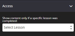
Drip
This feature allow you to select the number of days customers should wait before being able to access this lesson. 
- Type of drip
Automated: Based on registration date – This will deliver the content of your course page on autopilot and members will be able to access the page depending on their course registration date.
Scheduled: Deliver on a specific date – You can choose a specific date when the course page will be accessible. - Number of days / Time: Depending on the type of drip that you will select, for Automated, you have to specify the number of days based on the registration date when they can access the page. While for Scheduled, simply select the date, time, and timezone.
Note: The Timezone that is set in Global settings will be applied. - Coming Soon Text
Add descriptive teaser text, giving users a sneak peek at what they can expect in this lesson.
Animation
This tool allows you to add animation effects to your Lesson Block.

- Type
From this drop-down, you can choose a trigger to activate the animation i.e.
+ None – no animation will be applied
+ On Page Load – the animation is triggered as the page loads
+ On Page Scroll – the animation is triggered only when the user scrolls to that section. - Style
This feature adds an animation style to your Lesson Block. Simply choose the preferred option from the drop-down menu.
+ Fade In – the Lesson block will fade in from the background
+ Scale In – the Lesson block scales in from the background
+ Top – the Lesson block will slide in from the top
+ Right – the Lesson block will slide in from the right
+ Bottom – the Lesson block will slide in from the bottom
+ Left – the Lesson block will slide in from the left - Delay (ms)
If you want to add a time delay for when the bullet list appears, simply add the delay in milliseconds e.g. 3000ms will be a 3-second delay.
Mobile
This feature allows you to adjust the Font Size, Padding and Margin of the lesson block when on mobile view.

Display
This feature allows you to choose the type of device you want the Lesson block to display.
- Display
From this drop-down, you can choose which device you want to display the Lesson block
+ All Devices – the Complete Lesson block will be displayed on both desktop and mobile devices
+ Desktop Only – the Complete Lesson block will be displayed on desktop devices only
+ Mobile Only – the Complete Lesson block will be displayed on mobile devices only
+ None – the Complete Lesson block will not be displayed on both desktop and mobile devices
That’s it, click on SAVE CHANGES and you are done!
Related Article
Show the content of a Lesson Block only if user has completed other lesson
Mark Lesson Blocks as Favorites