
The Feature Box allows you to add a feature section to your Campaign or Course page to highlight specific information.

Below is an overview of the various Feature Box settings:

Details

- Position
This option allows you to adjust the position of the Feature image in the Feature Box.
It can be positioned to the left or right of the feature text. - Layout
You can adjust the layout proportions of the Feature image vs Feature text with this parameter. Simply choose your preferred layout type from the drop-down menu.
Title
Add the headline for your feature in the Title field provided.

-
Font
This tool will help you fully customize the font style of your Feature Title.
- Font Family
Use this feature to change your Feature Title’s Font type.
Click on the drop-down and select the Font type you prefer. - Font Size
This setting changes the size of your Feature Title.
Simply click on the slider and move it left or right to increase or decrease the text size. - Line Height
This setting increases or decreases the space between the lines of text.
Click on the drop-down and select the line height you prefer. - Text Color
This setting changes the color of your Feature Title.
To use custom colors, simply paste the Hex code of the exact color you want in field provided e.g. #000000 = black or click on the Color Picker button to the right of the field.
This will open the Color Wheel, where you can select whichever color you prefer.
- Font Family
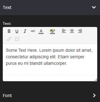
Text
Add the description of the feature in the Text field provided.
-
Font
This tool will help you fully customize the font style of your Feature Text.
- Font Family
Use this feature to change your Feature Text’s Font type.
Click on the drop-down and select the Font type you prefer. - Font Size
This setting changes the size of your Feature Text.
Simply click on the slider and move it left or right to increase or decrease the text size. - Line Height
This setting increases or decreases the space between the lines of text.
Click on the drop-down and select the line height you prefer. - Text Color
This setting changes the color of your Feature Text.
To use custom colors, simply paste the Hex code of the exact color you want in field provided e.g. #000000 = black or click on the Color Picker button to the right of the field.
This will open the Color Wheel, where you can select whichever color you prefer.
- Font Family
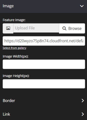
Image
-
Feature Image
Click on Browse to upload an image from your computer. When uploading an image, the original file name will be kept and a prefix will be added. This will help from an SEO perspective.
For example:
If you will upload an image called John.jpg, the image will be stored as 1234-John.jpg (1234 is the timestamp)
If you will upload an image with special characters on the filename, the image will be stored as %XX (XX are numbers e.g. # to %23)OR, click Select from gallery if you want to use an image that’s already been uploaded or been used in another template or page. Upon click, the image gallery popup window will appear with all the available images listed. The image with automatically scale to the width of the row the Feature Box Block has been added to. To setup precise custom dimensions for your image, simply adjust the following fields.
-
Image Width and Height
This will allow you to specify the width and height of an image.
-
Border
This setting allows you to add a border around your Feature Image.
-
- Borders
Select whether you want a full border where the feature image is wrapped in a border or simply one side of the image has a border e.g. None, All Border (full border), Top Border, Bottom Border, Right Border, Left Border, Left and Right Borders - Border Type
You can select the style for your border.
- Borders
TIP! In order to see the border around your Feature Box, you need to select one of the actual style options available e.g. Solid, dashed or dotted. If the setting is left on No Border Style, your selection in the Borders setting will not work.
- Border Size
You can change thickness of the border by selecting the pixel width you prefer. - Border Radius
You can add rounded edges to the border by selecting the relevant pixel width. - Border Color
You can change the color used for the border by selecting a new shade from the Color Wheel.
-
-
Link
Allows you to link pages to your image.
-
- Link
From the drop-down menu, the options are based on page type or custom destination.

- To add an internal page, simply select the appropriate page type (Campaign, Course, Blog, Portal Pages, or Optin Boxes). Once the preferred page type is selected, new drop down menu will appear to select the actual page.
- To add an external link, select Custom Destination. Then add your URL to the field provided. Make sure it is a valid and complete URL that starts with http:// or https://.
- Link
-
The options below are available on Course Pages only
-
-
- Open Members Directory
Choose this option if you want to display the member directory after clicking the button, instead of the normal way of going to the Avatar Profile > Members - Members of Course
This will open a pop-up window showing only members who have access to a specific course/course page they are viewing. With this, they can communicate and send private messages with each other and connect. - Open Messages
This will open the Messages popup window. To setup Messages, click here.
- Open Members Directory
-
The following settings are optional and not available on Optin Page page types.
-
- Open in New Tab (Optional)
Switch the toggle ON, depending on if you want the link to open in a new tab or not. - No follow (Optional)
This feature will allow you to set your links to no-follow. This is important if you want search engines to ignore your link.
If this is enabled, your link will not impact search engine rankings. - Pass URL parameters to next URL (Optional)
This feature allows you to pass tracking tags or data parameters from one page URL to another. Enable this feature if you are applying tracking tags to your URL or using certain features that require data to be passed on in order to work e.g. Auto Deadlines, Webinars, Viral Share tool, etc. - Pass member details (Optional)
This setting is available on Course pages only.
This feature will allow you to pass your members’ details to the next page.
For example, give access to special discounts on Order Pages exclusively accessible by your members.
- Open in New Tab (Optional)
Background
This setting allows you to change the background color of the Feature Box.
- If you type the work “transparent” in to the field provided, the background will be transparent and show what ever color is visible on the page.
- To change the background color, you can either add a Hex code in the field provided or choose a color from the Color Wheel.
- If the Color Wheel is closed, simply click on the Color Picker button to the right of the background field.
- The Background Color Opacity feature allows you to change the transparency of the background color of your text. Simply move the slider left or right to get the desired effect.
Width
From the drop-down, select the preferred width % you would like for your Feature Box block. The higher the % selected, the less margin will be added on either side of the title.

Borders
This feature allows you to add a border around your Feature Box.
- Borders
Select whether you want a full border where the feature is wrapped in a border or simply one side of the feature has a border e.g. None, All Border (full border), Top Border, Bottom Border, Right Border, Left Border, Left and Right Borders - Border Type
You can select the style for your border.TIP! In order to see the border around your Feature Box, you need to select one of the actual style options available e.g. Solid, dashed or dotted. If the setting is left on No Border Style, your selection in the Borders setting will not work. - Border Size
You can change thickness of the border by selecting the pixel width you prefer. - Border Radius
You can add rounded edges to the border by selecting the relevant pixel or percentage width. You may now control each side by entering the number on Top Left, Top Right, Bottom Right and Bottom Left box. - Border Color
You can change the color used for the border. To use custom colors, simply paste the Hex code of the exact color you want in field provided e.g. #000000 = black or click on the Color Picker button to the right of the field.
Box Shadow
This feature allows you to add a shadow around the border of your Feature Box Block.

- Horizontal Shadow Position
Adjust the horizontal position of the shadow. Use negative integer value to adjust horizontal position to left. Or use positive integer value to adjust to right. - Vertical Shadow Position
Adjust the vertical position of the shadow. Use negative integer value to adjust vertical position to top. Or use positive integer value to adjust to bottom. - Blur radius
Adjust the blur radius. This will determine how blurry the shadow will be. Use positive integer value. - Spread radius
Adjust the spread radius. This will determine how large the shadow will be. Use integer value. - Shadow Color
To use custom colors, simply paste the Hex code of the exact color you want in field provided e.g. #000000 = black, or click on the Color Picker button to the right of the field.
This will open the Color Wheel, where you can select whichever color you prefer. - Shadow Color Opacity
Adjust the opacity or transparency of the shadow. Click on the slider and move it left or right to increase or decrease the opacity. - Shadow Position
Adjust the position of the shadow, either inside or outside (default) the button
Alignment
This option will allow you to change the alignment and the text vertical alignment of the block.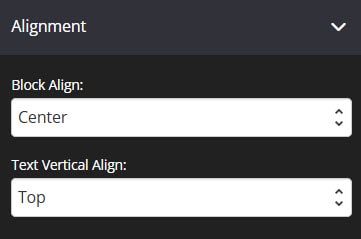
- Block Align
Allows you to adjust the alignment of your feature text and image. You may place it on the left, center or right side of your page.
NB: This will not work if the feature box width is set to 100%. - Text Vertical Align
Allows you to adjust the alignment of the text position. You may place the text on the top, center or bottom of the block.
Spacing
This feature allows you to add more space around your Feature Box Block.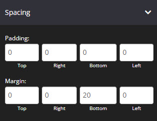
- Padding
You can add padding around your Feature Box, so that there is additional space. Simply add the numeric (pixel) value to the Top, Bottom, Right or Left Padding field provided.
This is particularly helpful if you want to add spaces inside your Feature Box block border. - Margin
You can add margin around your Feature Box, so that there is additional space.
Simply add the numeric (pixel) value to the Top, Bottom, Right or Left Margin field provided.
This is particularly helpful if you want to add spaces outside your Feature Box block border.
Options
This feature allows you to use the available options for extra coding (HTML/CSS/JavaScript) 
- Image Alt text:
This feature allows you to add an “alt tags” or “alt descriptions that appears in place of an image on a web page if the image fails to load on a user’s screen. This text helps screen-reading tools describe images to visually impaired readers and allows search engines to better crawl and rank your website. To learn more, please check here and this - Element Id:
This shows the element id of a specific block, which can then be used by CSS and JavaScript to perform certain tasks for the element with the specific id value. To learn more, please check here
- Classes:
This feature allows is used to define equal styles for elements with the same class name. To learn more, please check here
Drip
This feature allows you to manage when the elements will be visible to users.
Note: This option is available on Course pages only.
This is particularly useful if you don’t want to release all content on a particular page in one go.
Type of Drip:
- Automated: Based on registration date
This will deliver the content on autopilot and members will be able to access the element of the page depending on their course registration date.
Number of days: You have to specify the number of days based on the registration date when they can access the page. - Scheduled: Delivered on a specific date
With this feature, you can choose a date when a specific element will be accessible.
Simply select the date, time, and timezone
Animation
This tool allows you to add animation effects to your Feature Box.
- Type
From this drop-down you can choose a trigger to activate the animation i.e.
+ None – no animation will be applied
+ On Page Load – the animation is triggered as the page loads
+ On Page Scroll – the animation is triggered only when the user scrolls to that section. - Style
This feature adds an animation style to your Feature Box. Simply choose the preferred option from the drop-down menu.
+ Fade In – the Feature Box will fade in from the background
+ Scale In – the Feature Box scales in from the background
+ Top – the Feature Box will slide in from the top
+ Right – the Feature Box will slide in from the right
+ Bottom – the Feature Box will slide in from the bottom
+ Left – the Feature Box will slide in from the left - Delay (ms)
If you want to add a time delay for when the Feature Box appears, simply add the delay in milliseconds e.g. 3000ms will be 3 second delay.
Mobile
This feature allows you to adjust the size of the font when in mobile view.

- Image Width
You can enter the width size of the image for mobile view. - Font Size
You can enter the size of the text for mobile view.
Display
This feature allows you to choose the type of device you want the Image block to display.
- Display
From this drop-down, you can choose which device you want to display the Feature block
+ All Devices – the Feature block will be displayed in both desktop and mobile devices
+ Desktop Only – the Feature block will be displayed in desktop devices only
+ Mobile Only – the Feature block will be displayed in mobile devices only
+ None – the Feature block will not be displayed in both desktop and mobile devices
That’s it, click on SAVE and you are done!