
This block will be displaying the top 10 members who have the most points.
When your members access your membership site and you are rewarding them with points through the Gamification center. They will earn points based on the actions and as they get more points, they will be ranked and will be displayed in the leader board block.
The Leaderboard block can be added to your Membership Site, Portal Pages, Course pages, Social Wall pages, and Private Chat pages.
Below is an overview of the various Leaderboard Block settings:
Details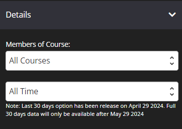
-
Members of Course
You may filter the top 10 list of members who will be displayed in the Leaderboard.
+ All Courses – This will display the top 10 members of all courses.
+ Specific course – This will display the top 10 members of the selected course. -
All Time
On leader board block we have a setting to select leader board time period. It allows to show members with highest results for selected period of time.
+ All Time – Once selected and saved, it will display the points in the leader board that have the highest results and have been accumulated over time.
+ 30 Days – Once selected and saved, it will display the points in the leader board that have the highest results and have been accumulated for 30 days.
Title Font
This allows you to edit the font family, size, line height, font weight and text color of the title. 
- Font Family
Use this feature to change your title’s Font type.
Click on the drop-down and select the Font type you want. - Font Size
This changes the size of your title.
Simply click on the slider and move it left or right to increase or decrease the text size. - Line Height
This feature increases or decreases the space between the lines of title.
Click on the drop-down and select the line height you prefer. - Font Weight
This feature changes the weight of title.
The font weight property sets how thick or thin characters in text should be displayed.
Click on the drop-down and select the font weight you prefer. - Text Color
This feature changes the color of your title.
To use custom colors, simply paste the Hex code of the exact color you want in field provided e.g. #000000 = black or click on the Color Picker button to the right of the field.
This will open the Color Wheel, where you can select whichever color you prefer.
Background
This feature allows you to add a background color on your board. By default it’s set to transparent.
Width
- Width
From the drop-down, select the preferred width % you would like for your Leaderboard block.
The higher the % selected, the less margin will be added on either side of the block.
Border
This feature allows you to add a border around your board.

- Borders
Select whether you want a full border where block is wrapped in a border or simply one side of the block has a border e.g. None, All Border (full border), Top Border, Bottom Border, Right Border, Left Border, Left and Right Borders - Border Type
You can select the style for your border.
TIP 01 In order to see the border around your block, you need to select one of the actual style options available e.g. Solid, dashed or dotted. If the setting is left on No Border Style, your selection in the Borders setting will not work.
TIP 02 To add space between your board and the border, remember to add Padding.
For more info on how to do this, scroll down to the Spacing section below. - Border Size
You can change thickness of the border by selecting the pixel width you prefer. - Border Radius
You can add rounded edges to the border by selecting the relevant pixel or percentage width. You may now control each side by entering the number on the Top Left, Top Right, Bottom Right and Bottom Left box. - Border Color
You can change the color used for the border. To use custom colors, simply paste the Hex code of the exact color you want in field provided e.g. #000000 = black or click on the Color Picker button to the right of the field.
Box Shadow
This feature allows you to add a shadow around the border of your Leaderboard Block.

- Horizontal Shadow Position
Adjust the horizontal position of the shadow. Use negative integer value to adjust horizontal position to left. Or use positive integer value to adjust to right. - Vertical Shadow Position
Adjust the vertical position of the shadow. Use negative integer value to adjust vertical position to top. Or use positive integer value to adjust to bottom. - Blur radius
Adjust the blur radius. This will determine how blurry the shadow will be. Use positive integer value. - Spread radius
Adjust the spread radius. This will determine how large the shadow will be. Use integer value. - Shadow Color
To use custom colors, simply paste the Hex code of the exact color you want in field provided e.g. #000000 = black, or click on the Color Picker button to the right of the field.
This will open the Color Wheel, where you can select whichever color you prefer. - Shadow Color Opacity
Adjust the opacity or transparency of the shadow. Click on the slider and move it left or right to increase or decrease the opacity. - Shadow Position
Adjust the position of the shadow, either inside or outside (default) the button.
Alignment
The feature allows you to reposition the leaderboard block on the page. You can choose either Left, Center or Right alignment from the drop-down. 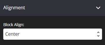
Spacing
This feature allows you to add more space around the block.
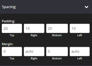
- Padding
You can add padding around the block, so that there is additional space. Simply add the numeric (pixel) value to the Top, Right, Bottom or Left padding field provided.
This is particularly helpful if you want to add spaces inside your Leaderboard block border. - Margin
This feature allows you to add more spaces outside the block.
Simply add the numeric (pixel) value to the Top, Right, Bottom or Left Margin field provided.
Animation
This tool allows you to add animation effects to your Leaderboard Block.

- Type
From this drop-down you can choose a trigger to activate the animation i.e.
+ None – no animation will be applied
+ On Page Load – the animation is triggered as the page loads
+ On Page Scroll – the animation is triggered only when the user scrolls to that section. - Style
This feature adds an animation style to your Leaderboard Block. Simply choose the preferred option from the drop-down menu.
+ Fade In – the Leaderboard block will fade in from the background
+ Scale In – the Leaderboard block scales in from the background
+ Top – the Leaderboard block will slide in from the top
+ Right – the Leaderboard block will slide in from the right
+ Bottom – the Leaderboard block will slide in from the bottom
+ Left – the Leaderboard block will slide in from the left - Delay (ms)
If you want to add a time delay for when the Leaderboard Block appears, simply add the delay in milliseconds e.g. 3000ms will be 3 second delay.
Display
This feature allows you to choose the type of device you want the Leaderboard block to display.

- Display
From this drop-down, you can choose which device you want to display the Leaderboard block.
+ All Devices – the Leaderboard block will be displayed on both desktop and mobile devices
+ Desktop Only – the Leaderboard block will be displayed on desktop devices only
+ Mobile Only – the Leaderboard block will be displayed on mobile devices only
+ None – the Leaderboard block will not be displayed on both desktop and mobile devices
That’s it, click on SAVE and you are done!
Related Articles
Members’ Area Gamification
How to enable the Progress Tracking