
A Filter Block allows your members to filter courses based on the keywords you added on your Course settings. You may only add Filter blocks to your Home Page and Portal pages.

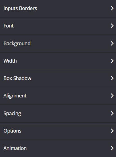
Below is an overview of the various Filter Block settings:
Inputs Borders
This feature allows you to modify the border around your Filter block.

- Borders
Select whether you want a full border where the Filter block is wrapped in a border or simply one side of the filter has a border e.g. None, All Border (full border), Top Border, Bottom Border, Right Border, Left Border, Left and Right Borders, etc. - Border Type
You can select the style for your border.
TIP 01 In order to see the border around your Filter block, you need to select one of the actual style options available e.g. Solid, Dashed or Dotted. If the setting is left on No Border Style, your selection in the Borders setting will not work.
TIP 02 To add space between your text and the border, remember to add Padding.
For more info on how to do this, scroll down to the Spacing section below.
- Border Size
You can change thickness of the border by selecting the pixel width you prefer. - Border Radius
You can add rounded edges to the border by selecting the relevant pixel or percentage width. You may now control each side by entering the number on the Top Left, Top Right, Bottom Right and Bottom Left box. - Border Color
You can change the color used for the border. To use custom colors, simply paste the Hex code of the exact color you want in field provided e.g. #000000 = black or click on the Color Picker button to the right of the field. This will open the Color Wheel, where you can select whichever color you prefer.
Font
This tool will help you fully customize the font style of your Filter block.

- Font Family
Use this feature to change your text’s Font type.
Click on the drop-down and select the Font type you want. - Font Size
This changes the size of your text.
Simply click on the slider and move it left or right to increase or decrease the text size. - Line Height
This feature increases or decreases the space between the lines of text.
Click on the drop-down and select the line height you prefer. - Text Color
This feature changes the color of your text.
To use custom colors, simply paste the Hex code of the exact color you want in field provided e.g. #000000 = black or click on the Color Picker button to the right of the field.
This will open the Color Wheel, where you can select whichever color you prefer.
Background
The feature allows you to change the background color of the Filter block.
- If you type the word “transparent” in to the field provided, the background will be transparent and show what ever color is visible on the page.
- To change the background color, you can either add a Hex code in the field provided or choose a color from the Color Wheel.
- If the Color Wheel is closed, simply click on the Color Picker button to the right of the background field.
Box Shadow
This feature allows you to add a shadow around the border of your Course Filter Block.
- Horizontal Shadow Position
Adjust the horizontal position of the shadow. Use negative integer value to adjust horizontal position to left. Or use positive integer value to adjust to right. - Vertical Shadow Position
Adjust the vertical position of the shadow. Use negative integer value to adjust vertical position to top. Or use positive integer value to adjust to bottom. - Blur radius
Adjust the blur radius. This will determine how blurry the shadow will be. Use positive integer value. - Spread radius
Adjust the spread radius. This will determine how large the shadow will be. Use integer value. - Shadow Color
To use custom colors, simply paste the Hex code of the exact color you want in field provided e.g. #000000 = black, or click on the Color Picker button to the right of the field.
This will open the Color Wheel, where you can select whichever color you prefer. - Shadow Color Opacity
Adjust the opacity or transparency of the shadow. Click on the slider and move it left or right to increase or decrease the opacity. - Shadow Position
Adjust the position of the shadow, either inside or outside (default) the button
Width
From the drop-down, select the preferred width % you would like for your Filter block. The higher the % selected, the less margin will be added on either side of the title.
Alignment
This feature allows you to reposition the Filter block on the page.
- Align
You can choose either Left, Center or Right alignment from the drop-down
Spacing
This feature allows you to add more space around your Filter Block.
- Padding
You can add padding outside your Filter block border, so that there is additional space. Simply add the numeric (pixel) value to the Top, Bottom, Right or left padding field provided. - Inner Padding
You can add padding inside your Filter block border, so that there is additional space. Simply add the numeric (pixel) value to the Top, Bottom, Right or left padding field provided. - Margin Bottom
This feature allows you to add more space below the Filter block
Simply add the numeric (pixel) value to the field provided.
Options
- Element Id
Shows the element id of the Filter block.
This is useful for under the hood, if you wanted custom HTML, coding/scripting for CSS and JavaScript. You can use the targeted id element for page design, rules and etc. - Classes
This feature is used to define equal styles for elements with the same class name. To learn more, please check here. - Display Rule
You have the option to choose All Members, Members of Course, Members of Group or Members of Any Group in the drop-down menu.
+ All Members (Default) – All members can see the item.
+ Members of Course – Members with access to the particular course can only see.
+ Members of Group – Members with access to the particular course group can only see.
+ Members of Any Group – Any members who have access to any course that belongs to any group.
Animation
This tool allows you to add animation effects to your Filter Block.
- Type
From this drop-down you can choose a trigger to activate the animation i.e.
+ None – no animation will be applied
+ On Page Load – the animation is triggered as the page loads
+ On Page Scroll – the animation is triggered only when the user scrolls to that section. - Style
This feature adds an animation style to your Filter Block. Simply choose the preferred option from the drop-down menu.
+ Fade In – the Filter Block will fade in from the background
+ Scale In – the Filter Block scales in from the background
+ Top – the Filter Block will slide in from the top
+ Right – the Filter Block will slide in from the right
+ Bottom – the Filter Block will slide in from the bottom
+ Left – the Filter Block will slide in from the left - Delay (ms)
If you want to add a time delay for when the Filter Block appears, simply add the delay in milliseconds e.g. 3000ms will be 3 second delay.