
The Registered Auto Webinar Date Countdown Timer counts down to the start of the Auto Webinar a user has registered for. This means that when a user arrives on your campaign page, based on the webinar time the user registered for, the countdown timer will start counting down to the start of that specific webinar.
To Get Started:
- Go to Campaigns, then select the relevant campaign and then open the page template you would like to edit.
TIP! You can use any page template for your pre webinar page, such as the Thank You page template.

- Once opened, click on the Countdown Timer Block in the preview pane on the right.
This will open the Countdown Timer’s settings in the left-sidebar menu
Settings Overview

Details
Once opened, select Registered Auto Webinar Date from the Countdown Timer Type: drop-down menu, in order to access the Registered Auto Webinar Date settings.
- Select Auto Webinar
From the drop-down, select the Auto Webinar that you setup.
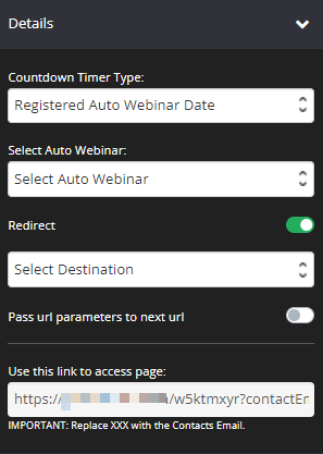
- Redirect
By default, it is disabled. Simply switch the toggle on if you want to set up a redirect page.
Select the page you would like users to reach, after the timer counts down to zero.
TIP! If you prefer to use a URL , scroll to the bottom of the drop-down menu and select Redirect to URL, then add the relevant URL in the field provided. - Pass URL parameters to next URL
Once enabled, the URL parameters will be passed to the next page. - Use this link to access page:
Under the Use This Link field, we have provided a special link you can email your registered users to access this pre-webinar page.You will replace the XXX with the contact’s email. Your email service will likely have a little piece of code that you can add here, and then they will be able to add the contact’s email to the link dynamically – http://yourwebsitename.com/21qxucp3?contactEmail=XXXInfusionsoft Example
http://yourwebsitename.com/21qxucp3?contactEmail=~Contact.Email~When a person accesses your page, we are going to check their email to confirm if they have been registered for the Registered Auto Webinar Date timer. If they have, then we will check the webinar deadline set for the timer.If today is before the deadline and the user accesses the pre-webinar page, they will see the Timer countdown to the start of their webinar. If today is after the deadline, then the user will automatically be redirected to the URL selected for the Redirect page.
The following fields are the styling options for your Countdown Timer:
Style
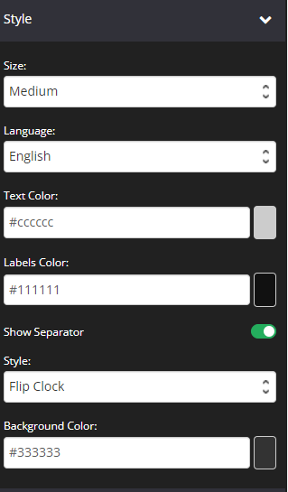
- Size
From the drop-down, select the size you want the Countdown timer to be: Small|Medium|Large. - Language
From the drop-down, select what language you want used for your Timer Labels. - Text Color
Choose whatever color you prefer for the Timer text (timer numbers).
Simply click on the color selector (square button) to the right of color field. - Labels Color
Choose whatever color you prefer for the labels below the timer
Simply click on the color selector (square button) to the right of color field. - Show Separator
Enable this option to show a separator (:) on the timer. - Style
+ Flip Clock – This is the default style.
+ Standard Clock – This will give you more options to customize your timer such as borders (type, size, radius and color), background color, and inner spacing & outer spacing.
- Background Color
Choose whatever color you prefer for the Timer Background
Simply click on the color selector (square button) to the right of color field.
Background
The feature allows you to change the background color of the Countdown Timer block.

- If you type the word “transparent” in to the field provided, the background will be transparent and show what ever color is visible on the page.
- To change the background color, you can either add a Hex code in the field provided or choose a color from the Color Wheel.
- If the Color Wheel is closed, simply click on the Color Picker button to the right of the background field.
Border
This feature allows you to add a border around your Countdown Timer block.

- Borders
Select whether you want a full border where text is wrapped in a border or simply one side of the block has a border e.g. None, All Border (full border), Top Border, Bottom Border, Right Border, Left Border, Left and Right Borders - Border Type
You can select the style for your border.
TIP 01 In order to see the border around your block, you need to select one of the actual style options available e.g. Solid, dashed or dotted. If the setting is left on No Border Style, your selection in the Borders setting will not work.
TIP 02 To add space between your block and the border, remember to add Padding.
For more info on how to do this, scroll down to the Spacing section below.
- Border Size
You can change thickness of the border by selecting the pixel width you prefer. - Border Radius
You can add rounded edges to the border by selecting the relevant pixel or percentage width. You may now control each side by entering the number on the Top Left, Top Right, Bottom Right and Bottom Left box. - Border Color
You can change the color used for the border. To use custom colors, simply paste the Hex code of the exact color you want in field provided e.g. #000000 = black or click on the Color Picker button to the right of the field. This will open the Color Wheel, where you can select whichever color you prefer.
Box Shadow
This feature allows you to add a shadow around the border of your Countdown Timer Block.

- Horizontal Shadow Position
Adjust the horizontal position of the shadow. Use negative integer value to adjust horizontal position to left. Or use positive integer value to adjust to right. - Vertical Shadow Position
Adjust the vertical position of the shadow. Use negative integer value to adjust vertical position to top. Or use positive integer value to adjust to bottom. - Blur radius
Adjust the blur radius. This will determine how blurry the shadow will be. Use positive integer value. - Spread radius
Adjust the spread radius. This will determine how large the shadow will be. Use integer value. - Shadow Color
To use custom colors, simply paste the Hex code of the exact color you want in field provided e.g. #000000 = black, or click on the Color Picker button to the right of the field.
This will open the Color Wheel, where you can select whichever color you prefer. - Shadow Color Opacity
Adjust the opacity or transparency of the shadow. Click on the slider and move it left or right to increase or decrease the opacity. - Shadow Position
Adjust the position of the shadow, either inside or outside (default) the button
Alignment
- Horizontal Align
From the drop-down, select if you want the timer left | center | right aligned.
Spacing
If you want to add more margin below the Countdown Timer, simply increase the value of this field.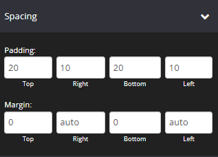
- Padding
You can add padding around your text, so that there is additional space. Simply add the numeric (pixel) value to the Top, Bottom, Right or Left Padding field provided.
This is particularly helpful if you want to add spaces inside your Countdown Timer border. - Margin
You can add margin around your text, so that there is additional space.
Simply add the numeric (pixel) value to the Top, Bottom, Right or Left Margin field provided.
This is particularly helpful if you want to add spaces outside your Countdown Timer border.
Options
This feature allows you to use the available options for extra coding (HTML/CSS/JavaScript)
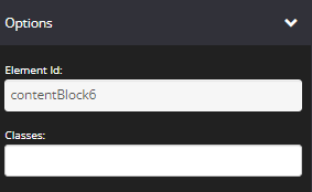
- Element Id:
This shows the element id of a specific block, which can then be used by CSS and JavaScript to perform certain tasks for the element with the specific id value. To learn more, please check here
- Classes:
This feature allows is used to define equal styles for elements with the same class name. To learn more, please check here
Animation
This tool allows you to add animation effects to your Evergreen Countdown Timer.

- Type
From this drop-down you can choose a trigger to activate the animation i.e.
+ None – no animation will be applied
+ On Page Load – the animation is triggered as the page loads
+ On Page Scroll – the animation is triggered only when the user scrolls to that section. - Style
This feature adds an animation style to your Evergreen Timer. Simply choose the preferred option from the drop-down menu.
+ Fade In – the Timer will fade in from the background
+ Scale In – the Timer scales in from the background
+ Top – the Timer will slide in from the top
+ Right – the Timer will slide in from the right
+ Bottom – the Timer will slide in from the bottom
+ Left – the Timer will slide in from the left - Delay (ms)
If you want to add a time delay for when the Evergreen Timer appears, simply add the delay in milliseconds e.g. 3000ms will be 3 second delay.
Display
This feature allows you to choose the type of device you want the Countdown Timer block to display.

- Display
From this drop-down, you can choose which device you want to display the Countdown Timer block
+ All Devices – the Countdown Timer block will be displayed on both desktop and mobile devices
+ Desktop Only – the Countdown Timer block will be displayed on desktop devices only
+ Mobile Only – the Countdown Timer block will be displayed on mobile devices only
+ None – the Countdown Timer block will not be displayed on both desktop and mobile devices
Once done, click on SAVE.
Related Articles
Setting up a Fixed Date Countdown Timer
Setting up an Evergreen Countdown timer
Setting up an Auto Deadline Countdown timer
Setting up an Auto Webinar Start Countdown Timer