
The Carousel block allows you to add several images on all your pages.
Below is an overview of the various Carousel Block settings:

Details 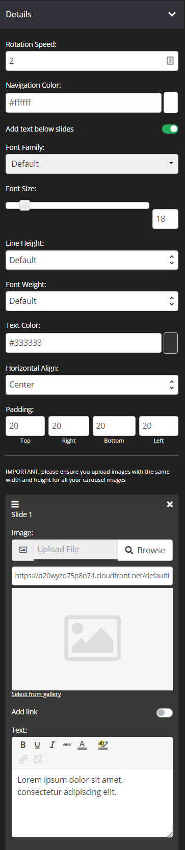
- Rotation Speed
By default, the rotation speed is set to 2 seconds but you can change the speed according to your desired rotation speed of the images. - Navigation Color
This option will allow you to customize the navigation color.
To change the color, you can either add a Hex code in the field provided or choose a color from the Color Wheel.
If the Color Wheel is closed, simply click on the Color Picker button to the right of the navigation color field. - Add text below slides
Enabling this option will allow you to add text to the carousel block.
+ Font Family
Use this feature to change your text’s Font type.
Click on the drop-down and select the Font type you want.
+ Font Size
This changes the size of your text.
Simply click on the slider and move it left or right to increase or decrease the text size.
+ Line Height
This feature increases or decreases the space between the lines of text.
Click on the drop-down and select the line height you prefer.
+ Font Weight
This feature changes the weight of text.
The font weight property sets how thick or thin characters in text should be displayed.
Click on the drop-down and select the font weight you prefer.
+ Text Color
This feature changes the color of your text.
To use custom colors, simply paste the Hex code of the exact color you want in field provided e.g. #000000 = black or click on the Color Picker button to the right of the field. This will open the Color Wheel, where you can select whichever color you prefer.
+ Horizontal Align
Allows you to adjust the horizontal alignment of your text. You may place it on the left, center or right side of the carousel block.
+ Padding
You can add padding around your text, so that there is additional space. Simply add the numeric (pixel) value to the Top, Bottom, Right or Left Padding field provided.
- Image
Click on Browse to upload an image from your computer.
The max image file size can be 500kb. You can click Select from gallery if you want to use an image that’s already been uploaded or been used in another template or page. Once clicked, the image gallery popup window will appear with all the available images listed. - Add Link
When an add link is enabled, this allows you to link one of your KLEQ pages or a custom destination to your image. From the drop-down menu, the options are based on page type or custom destination. - To add an internal page, simply select the appropriate page type (Campaign, Course, Blog, Portal Pages, or Optin Boxes). Once the preferred page type is selected, a new drop down menu will appear to select the actual page.
- To add an external link, select Custom Destination. Then add your URL to the field provided. Make sure it is a valid and complete URL that starts with http:// or https://.
The following settings are optional and not available on Optin Page page types.
+ Open in New Tab (Optional)
Switch the toggle ON, depending on if you want the link to open in a new tab or not.
+ No follow (Optional)
This feature will allow you to set your links to no-follow. This is important if you want search engines to ignore your link.
If this is enabled, your link will not impact search engine rankings.
+ Pass URL parameters to next URL (Optional)
This feature allows you to pass tracking tags or data parameters from one page URL to another. Enable this feature if you are applying tracking tags to your URL or using certain features that require data to be passed on in order to work e.g. Auto Deadlines, Webinars, Viral Share tool, etc.
- Text
Simply add the text for your carousel block.
- Add Item
The + Add Item button allows you to add more carousel images if needed.
Simply click on the button and a new option to add a carousel image will appear. - Drag & Drop (3 lines) icon
There’s the move/drag icon that you may use to move and reorganize the items.

- Delete (x) icon
Simply click on the delete icon to delete the list item on the carousel image block.
Background
This feature allows you to add a background color on your carousel images . By default it’s set to transparent.
Width
From the drop-down, select the preferred width % you would like for your Carousel block. The higher the % selected, the less margin will be added on either side of the title.

Borders
This feature allows you to add a border around your Carousel block.
- Borders
Select whether you want a full border where block is wrapped in a border or simply one side of the block has a border e.g. None, All Border (full border), Top Border, Bottom Border, Right Border, Left Border, Left and Right Borders - Border Type
You can select the style for your border.
TIP 01 In order to see the border around your block, you need to select one of the actual style options available e.g. Solid, dashed or dotted. If the setting is left on No Border Style, your selection in the Borders setting will not work.
TIP 02 To add space between your Blog post and the border, remember to add Padding. For more info on how to do this, scroll down to the Spacing section below.
- Border Size
You can change thickness of the border by selecting the pixel width you prefer. - Border Radius
You can add rounded edges to the border by selecting the relevant pixel or percentage width. You may now control each side by entering the number on Top Left, Top Right, Bottom Right and Bottom Left box. - Border Color
You can change the color used for the border. To use custom colors, simply paste the Hex code of the exact color you want in field provided e.g. #000000 = black or click on the Color Picker button to the right of the field.
Box Shadow
This feature allows you to add a shadow around the border of your Carousel Block.

- Horizontal Shadow Position
Adjust the horizontal position of the shadow. Use negative integer value to adjust horizontal position to left. Or use positive integer value to adjust to right. - Vertical Shadow Position
Adjust the vertical position of the shadow. Use negative integer value to adjust vertical position to top. Or use positive integer value to adjust to bottom. - Blur radius
Adjust the blur radius. This will determine how blurry the shadow will be. Use positive integer value. - Spread radius
Adjust the spread radius. This will determine how large the shadow will be. Use integer value. - Shadow Color
To use custom colors, simply paste the Hex code of the exact color you want in field provided e.g. #000000 = black, or click on the Color Picker button to the right of the field.
This will open the Color Wheel, where you can select whichever color you prefer. - Shadow Color Opacity
Adjust the opacity or transparency of the shadow. Click on the slider and move it left or right to increase or decrease the opacity. - Shadow Position
Adjust the position of the shadow, either inside or outside (default) the button
Alignment
The feature allows you to reposition the carousel block on the page. You can choose either Left, Center or Right alignment from the drop-down. 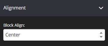
Spacing
This feature allows you to add more space around the block.

- Padding
You can add padding around your block so that there is additional space.
Simply add the numeric (pixel) value to the Top, Bottom, Right or left padding field provided.
This is particularly helpful if you want to add a border around your block. - Margin
This feature allows you to add more spaces outside the block.
Simply add the numeric (pixel) value to the Top, Right, Bottom or Left Margin field provided.
Options
This feature allows you to use the available options for extra coding (HTML/CSS/JavaScript)
- Element Id:
This shows the element id of a specific block, which can then be used by CSS and JavaScript to perform certain tasks for the element with the specific id value. To learn more, please check here. - Classes:
This feature is used to define equal styles for elements with the same class name. To learn more, please check here.
Animation
This tool allows you to add animation effects to your Carousel Block.
- Type
From this drop-down you can choose a trigger to activate the animation i.e.
+ None – no animation will be applied
+ On Page Load – the animation is triggered as the page loads
+ On Page Scroll – the animation is triggered only when the user scrolls to that section. - Style
This feature adds an animation style to your Carousel Block. Simply choose the preferred option from the drop-down menu.
+ Fade In – the Carousel block will fade in from the background
+ Scale In – the Carousel block scales in from the background
+ Top – the Carousel block will slide in from the top
+ Right – the Carousel block will slide in from the right
+ Bottom – the Carousel block will slide in from the bottom
+ Left – the Carousel block will slide in from the left - Delay (ms)
If you want to add a time delay for when the bullet list appears, simply add the delay in milliseconds e.g. 3000ms will be 3 second delay.
Display
This feature allows you to choose the type of device you want the Carousel block to display.

- Display
From this drop-down, you can choose which device you want to display the Carousel block.
+ All Devices – the Carousel block will be displayed in both desktop and mobile devices
+ Desktop Only – the Carousel block will be displayed in desktop devices only
+ Mobile Only – the Carousel block will be displayed in mobile devices only
+ None – the Carousel block will not be displayed.
That’s it, click on SAVE and you are done!