
The Progress Bar Block allows you to add a graphic element to visualize progress on a page. An example would be to show user progress on your Optin popup or Optin page as they optin.
To add a Progress Bar Block
In the right Preview Pane, mouse over the Row (green border) where you want to add a new Block element.
Next, mouse over any existing Block (gray border) in the Row, and click on the black (+) icon at the bottom of the Block. This will open the Blocks element list in the left sidebar menu.
You will find the Progress Bar block at the bottom of the element list.
Once added, the Progress Bar block settings will appear in the left sidebar menu.

Below is an overview of the various Progress Bar block settings.

Details

- Title
In the field provided, add the new text you want to display in your progress bar. - Progress
This tool will allow you to change the visualization of the progress bar.
From this drop-down you can choose progress bar percentage you want to display.
+ 50% – the progress will cover half of the bar
+ 75% – the progress will cover three quarters of the bar
Font
This tool will help you fully customize the font style of your progress bar’s text.

- Font Family
Use this feature to change your text’s Font type.
Click on the drop-down and select the Font type you want. - Font Size
This changes the size of your text.
Click on the slider and move it left or right to increase or decrease the text size. - Line Height
This feature increases or decreases the space between the lines of text.
Click on the drop-down and select the line height you prefer. - Letter Spacing
This feature increase or decreases the space between each letter.
Click on the drop-down and select the letter spacing you prefer. - Text Color
This feature changes the color of your text.
To use custom colors, paste the Hex code of the exact color you want in field provided e.g. #000000 = black or click on the Color Picker button to the right of the field.
This will open the Color Wheel, where you can select whichever color you prefer.
Background
The feature allows you to change the color of the progress bar.

- Background Color
To change the background color, you can either add a Hex code in the field provided or choose a color from the Color Wheel.
If you type the word “transparent” in to the field provided, the background will be transparent and show what ever color is visible on the page.
If the Color Wheel is closed, click on the Color Picker button to the right of the background field.
Width
- Width
From the drop-down, select the preferred width % you would like for your Progress Bar block. The higher the % selected, the less margin will be added on either side of the title.

Spacing
This feature allows you to add more space around your Progress Bar block.

- Margin Bottom
This feature allows you to add more space below the Progress Bar block
Add the numeric (pixel) value to the field provided.
Options
This feature allows you to use the available options for extra coding (HTML/CSS/JavaScript), and Drip Content feature to control which content to display.
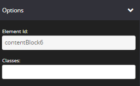
- Element Id:
This shows the element id of the lesson block, which can then be used by CSS and JavaScript to perform certain tasks for the element with the specific id value. To learn more, please check here
- Classes:
This feature is used to define equal styles for elements with the same class name. To learn more, please check here
Animation
This tool allows you to add animation effects to your Progress Bar block.

- Type
From this drop-down you can choose a trigger to activate the animation i.e.
+ None – no animation will be applied
+ On Page Load – the animation is triggered as the page loads
+ On Page Scroll – the animation is triggered only when the user scrolls to that section. - Style
This feature adds an animation style to your Progress Bar Block. Choose the preferred option from the drop-down menu.
+ Fade In – the Progress Bar will fade in from the background
+ Scale In – the Progress Bark scales in from the background
+ Top – the Progress Bar will slide in from the top
+ Right – the Progress Bar will slide in from the right
+ Bottom – the Progress Bar will slide in from the bottom
+ Left – the Progress Bar will slide in from the left - Delay (ms)
If you want to add a time delay for when the Progress Bar Block appears, add the delay in milliseconds e.g. 3000ms will be 3 second delay.
Display
This feature allows you to choose the type of device you want the block to display.

- Display
From this drop-down, you can choose which device you want to display the Progress Bar block.
+ All Devices – the Progress Bar block will be displayed on both desktop and mobile devices
+ Desktop Only – the Progress Bar block will be displayed on desktop devices only
+ Mobile Only – the Progress Bar block will be displayed on mobile devices only
+ None – the Progress Bar block will not be displayed on both desktop and mobile devices
Once done, click SAVE.